Wenny's Handbag's solution to the online market
Team
Osbert Reynaldi
Roles
UI/UX Designer
User Researcher
Graphic Designer
Web Developer
Tools
WordPress
Canva
Figma
HTML5/CSS3
Skills
UI/UX Design
User Research
Market Research
User Research
TIMELINE
June – August 2021
SUMMARY
CHALLENGE
As a company founded in 1986 dealing with consumer good manufacturing, the technology department wasn’t its strongest suit. So when I was hired as a software engineer intern for the Summer of 2021, I was their tech guy. I realized that all of their customers were gained through either word-of-mouth or their reputation through working with big-named brands. And as such, they would have about 50 individual customers across their retail branches and about 2 large orders from big companies per month. Due to these numbers, Wenny’s Handbag would have gaps in their activity. I realized that through their products and capabilities, they would do well and become a strong competitor for their market in the online space. The challenge for me, was to figure out how exactly I would accomplish establishing their online presence and what I should focus on first.
ROADMAP
So I proposed a solution; a technological revamp of their whole internet identity so that they can appeal to larger audiences in the internet through social media and online stores. I decided, what better way to start than through a portfolio website where people could visit and access all their links. I figured this would work as their word-of-mouth sales were already strong and their reputation was verifiable through their existing activities.
MARKET & USER
RESEARCH
ANALYZING COMPETITORS AND USERS
MARKET RESEARCH


What I found:
Landing Pages belonging to big companies typically feature object(s)/subject(s) that reveal to the customers their brand identity; this includes logos, company policies, defining product(s)/feature(s).
These websites also highlight either on the navigation bar or the main content itself, an “about us” section, a products section, shop now section and a contacts page.
Placing readable material and interactive content on the left or center is ideal. Buttons are such as the “cek sekarang” button on Tokopedia’s main page or Louis Vuitton’s “Shop the Collection” button intrigue users and make them think “it’s only a button that I have to press”. This unlocks a whole new page for the user making them browse out of curiosity, drawing them further into the website and products.
Key Takeaways:
- User Experience is enhanced through simplicity and an element of intrigue.
- People love it when they have things seamless. With buttons, people click and they are taken to another visual world; so little energy for so much.
- The key elements to have in a portfolio website are: company defining features, informative page/link, product page, and contacts page.
But first, how would we :
Begin to enter the online market and attract the Indonesian public?
USER RESEARCH
DEMOGRAPHIC RESEARCH
- Nearly 60% of Indonesians are below the age of 30 or below.
- Modern retail is rising in exposure, taking over the traditional market (such as physical stores)
- Indonesians prefer and trust local brands more than others
Based on research about Indonesia’s consumers, it would be in the best interest of the company to try and appeal towards the younger generation. In addition to this, there is also the fact that the company is already attracting customers of the older age-group in the high-middle economic class. This is because the company itself was founded in 1986 and has since been building a loyal customer base.
Since the Indonesian public is also increasing in their capability to purchase, they are increasing their accessibility to access the online market as they buy capable goods like smartphones and computers.
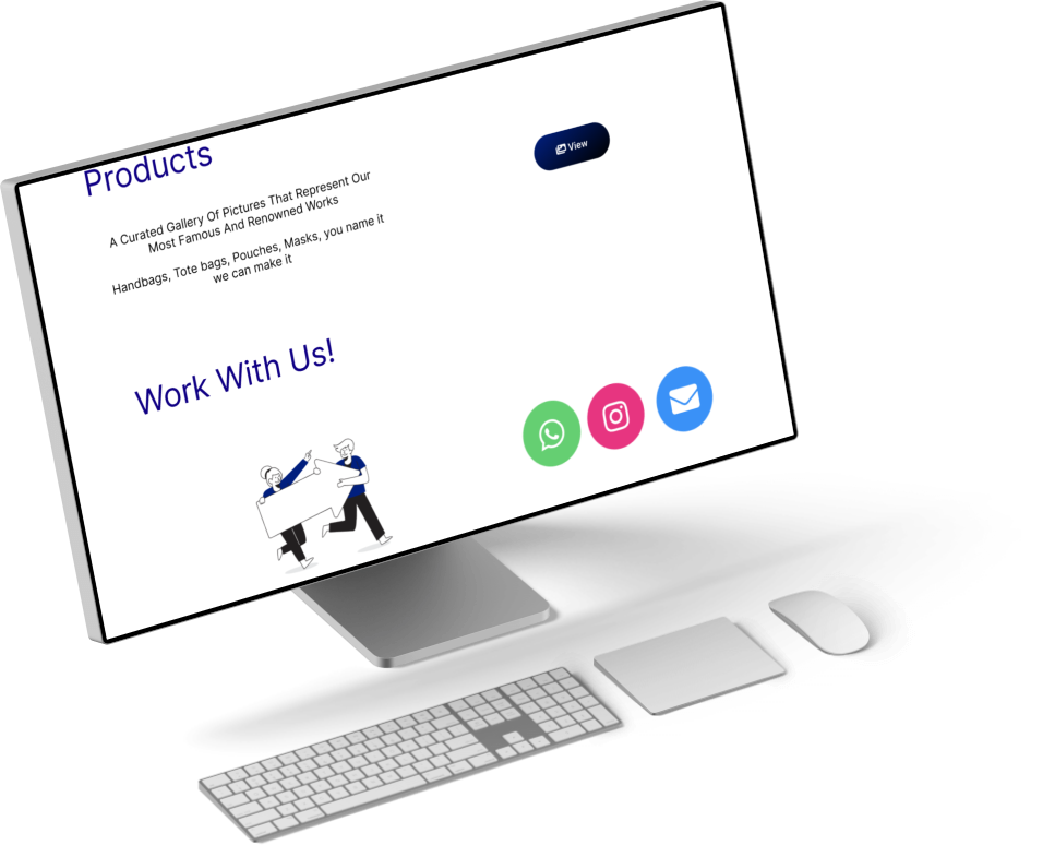
Websites like linktree.com, milkshake.app and carrd.co have also been on the rise. Social media users have been using these websites to showcase their links and portfolio by placing them in profile descriptions. Taking inspiration from these websites would utilize the concept of familiarity and help users become accustomed to the message of our website sooner. As such, the Wenny’s Handbag portfolio website should contain links that showcase their social media profiles and work.
UI/UX & GRAPHIC
DESIGN
IDEATION > FLOW > DESIGN
IDEATION
Takeaways
Word-of-mouth is key in terms of the spreading of reputation and awareness.
A portfolio website is a good starting point because it can build a customer base through direct consumer-to-business contact, it is easy to promote and UI/UX can be built in such a way that it targets a specific audience
FLOW
Designing the user flow:
I believe the best course of action would be to design something that represents the company’s identity similar to the websites mentioned above. The element of focus is also important in this case. By creating heatmaps of the aforementioned websites that our inspiration comes from, we can begin to dissect which elements of a website are sought after by users the most.
USER HEATMAPS


Every color on the heatmaps represents different levels of interactivity with users:
- Red represents most interacted with
- Orange represents frequently interacted with
- Yellow represents average levels of interaction
- Green represents less interaction
- Blue represents little to no interaction.
The user heatmaps above were designed through inputs from structured interviews. To achieve this, I interviewed a sample size of 5 people.
- I would present to these people the landing pages of the website one by one in-person.
- I would ask them if they were a user, which element of the website would they most likely interact with first
- I would allow them a few minutes to play-around with each website’s UIs. Through this, I would observe and gain qualitative data on their behaviors and record it to create heatmaps.
FINAL USER FLOW DESIGN
Since we now have information from the heatmap about the most important aspects of a website, it’s time to implement the findings. I was able to create a flowchart (using figjam) and I decided to make 2 separate webpages since this is a manufacturing and production company; a landing page, and a product showcase.
WIREFRAMING
LOW-FIDELITY WIREFRAMING
By starting with low-fidelity wireframing, I was able to place down my rough ideas into a sketch which conveys an idea of what the pages of the website should contain.
SOLUTION: HIGH-FIDELITY WIREFRAMING
Using the flowcharts and low-fidelity sketches, I was able to transform them into digital wireframes through Figma. I finalized the high-fidelity wireframe with the company logo, CTA buttons and also a rough idea of a timeline layout (specially requested by the CEO).
UI/UX & GRAPHIC
DESIGN
FINAL INTERFACE AND EXPERIENCE
FINAL EXPERIENCE
FINAL PRODUCT
Key Takeaways
This was my first time making a professional portfolio for an established company. At first I was really nervous, not thinking highly of my skills and afraid of failure. However, as I kept continuing to work on it, I realized why I decided to take an interest in UI/UX design in the first place; the joy of creation. I regained a sense of motivation and can truly say that I overcame one of my first hurdles as a designer. This was truly a challenge both mentally and from a design aspect. I tried to also utilize the things I learned in college as a Cognitive Science major. Research was either based on sample size or brainstorming which not only eliminates cognitive biases like eliminating the positives but also jumping to conclusions. As a designer and thinker, it is sometimes important to let go and let the world inspire you. The best ideas come from places you least expect.
I’ve always taken an interest in portfolio and company websites of fashion companies so this challenge was particularly enjoyable for me. I remember looking at websites like fearofgod.com and kith.com thinking to myself how does one go about thinking of a UI for these kinds of websites. I couldn’t wrap my head around if it would be simple or entirely complex. But now, after going through a design process myself and figuring out design portfolios, I can truly say that I am beginning to understand more. I now understand why you need a team of collaborative designers, why this requires a tremendous amount of attention and thinking and why this line of work is incredibly in demand.