EasyCash
Roles:
Founder, UI/UX Designer, Brand Designer
Duration:
Aug 2022 – Present
Tools:
Figma, Illustrator

EasyCash
UI/UX and Brand Design
Founder
As the Founder and Lead Product Designer, I led the design and development of a pioneering fintech app addressing the complexities of money transfers in Indonesia’s digital payment landscape, simplifying the banking experience for Indonesian users.
Context
🔮 Overview
While Indonesia has countless contactless payment and wallet systems including OVO, GoPay, BCA Virtual Transfer, etc, people still rely on the old-fashioned bank transfer to send money from one person to another. This might be done through individual bank apps like BCA mobile. The main issue here lies in the complexity. If a user wants to send money to another user in a different bank, they have to first input the bank’s identification code, then the account number and then pay a fee of around $0.34. Our aim was to create an app that would provide a simple and intuitive experience in a complex banking environment.
🗺️ Roadmap
I started the process by researching the Indonesian millenials, and gen-z demographic to create user profiles, customer journey maps and affinity maps to eliminate personal cognitive biases. Through this, I learnt relevant user pain points, expectations, opportunities and action items.
Then, I proceeded to design low-fidelity and high-fidelity wireframes through Figma. After the whole design process I needed to design a fully functioning prototype of an IOS app. This solution needed to be user-friendly, simple and neat with every function within 3 button clicks.
Problem
The Challenge: How might we create a seamless financial experience for Indonesian users that promotes intuitiveness and functionality?
The ultimate goal of any retail company is to be bought and adopted by as many people as people; hence, endless expansion. An Amazon storefront would increase discoverability and user education by informing them in an orderly way, what they can buy and what they can do with our products. A well-designed store page would give users an impression of establishment. Improved product packaging would also increase shelf visibility and consumer engagement through the psychologically-motivated placement of elements.
Research
📖 Market Research
To understand the flaws of the competition and identify opportunities, I needed to conduct a Competitive Analysis of existing products used by the Indonesian public. I identified the pros and cons of the three most prevalent apps to extract some common pain points. These were assumptions.
📖 User Research
To clarify these assumptions and assert some Pivot Points, I conducted a User Survey that inquires about the frustrations, experiences, and processes of money transfers in Indonesia. the target audience here was Indonesian citizens.
Constraints: As this user research was done during my time in the United States, I was not able to gather significant data and user experience from a large random sample of Indonesian users. Instead, I conducted a survey by having my Indonesian friends and colleagues fill out a quick google forms survey.
“Interface is ugly and some features hard to find”
– Participant #1
“It is very complicated and even though there are so many ways, none of them are easy”
– Participant #4
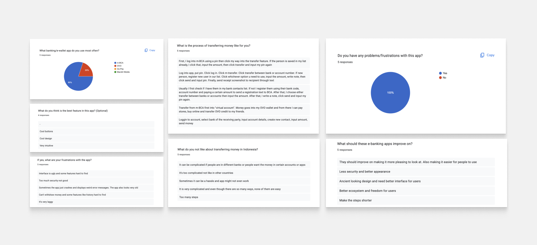
🍟 Takeaways
- Most of the UI/UX involved with these apps are complicated and look unappealing to users who might not be too familiar with tech. They are either cluttered or take too many clicks to reach a certain function.
- Banking is often not a direct process as users need to go through a lot of different steps to transfer money.
- The most important feature for most users, the transaction history, is abnormally hard to find in most of these apps
Research
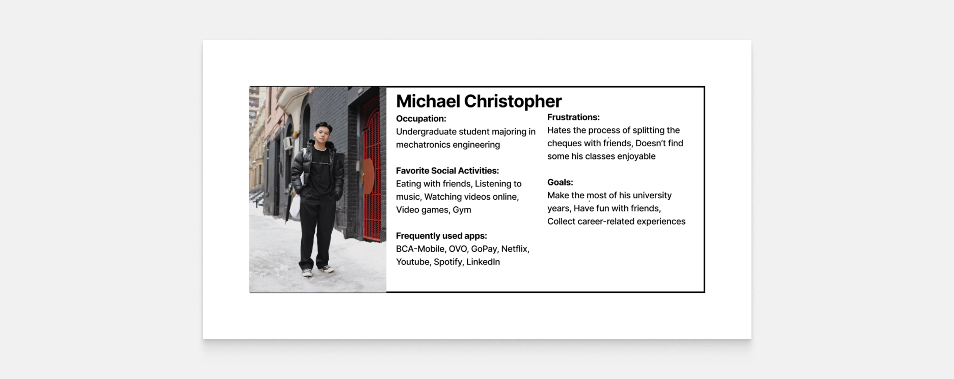
User Persona
To create a solution more representative of our target audience, I decided to focus on a User Persona that embodies the user and market research takeaways.
Research
User Journey
I leveraged the user persona to create a better understanding of how a typical user or customer would interact with a banking app in Indonesia. I represented some touch points in a user’s experience based on 4 stages, inquiry, process, transfer, and verification.
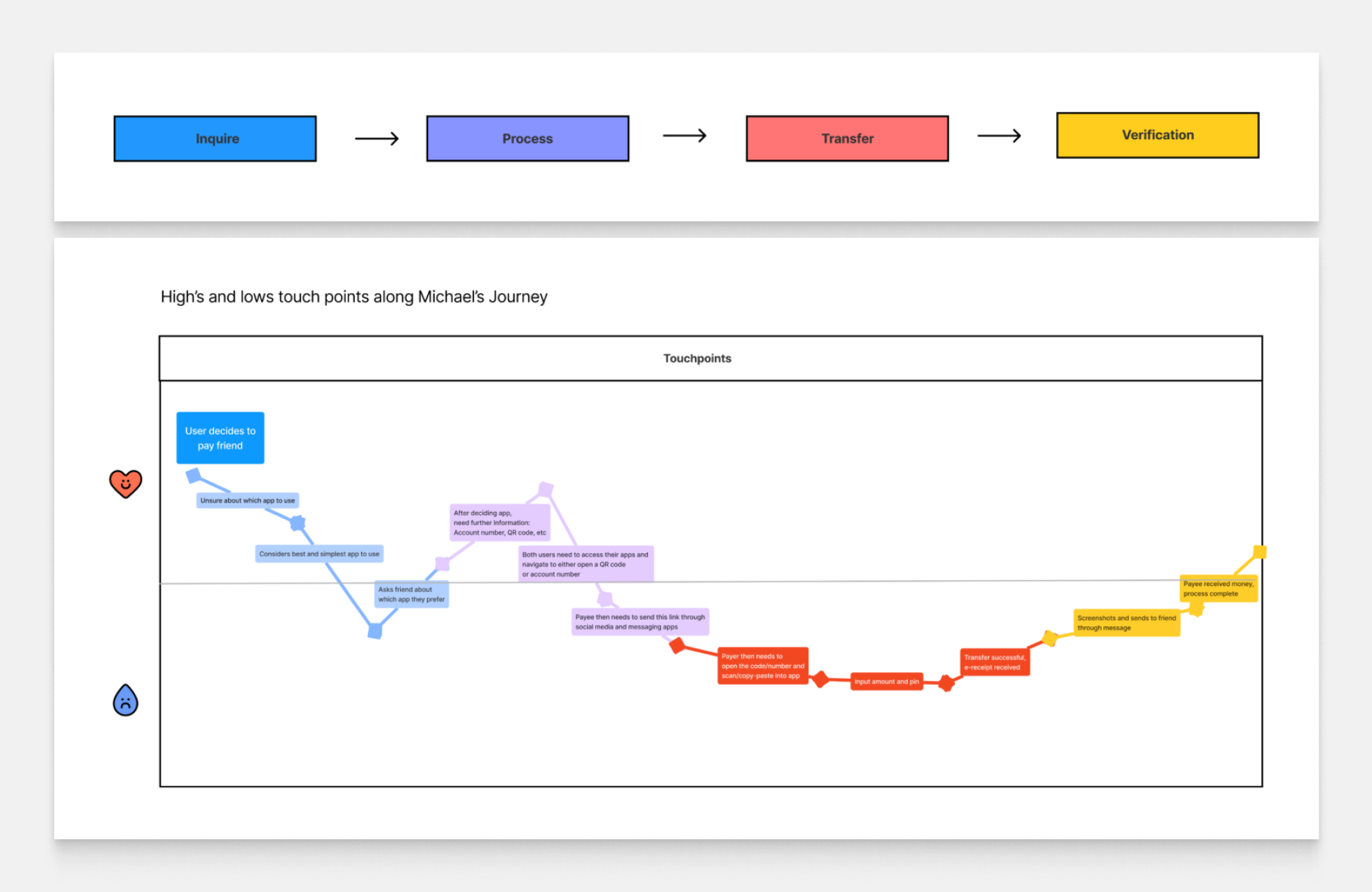
🌎 Takeaways
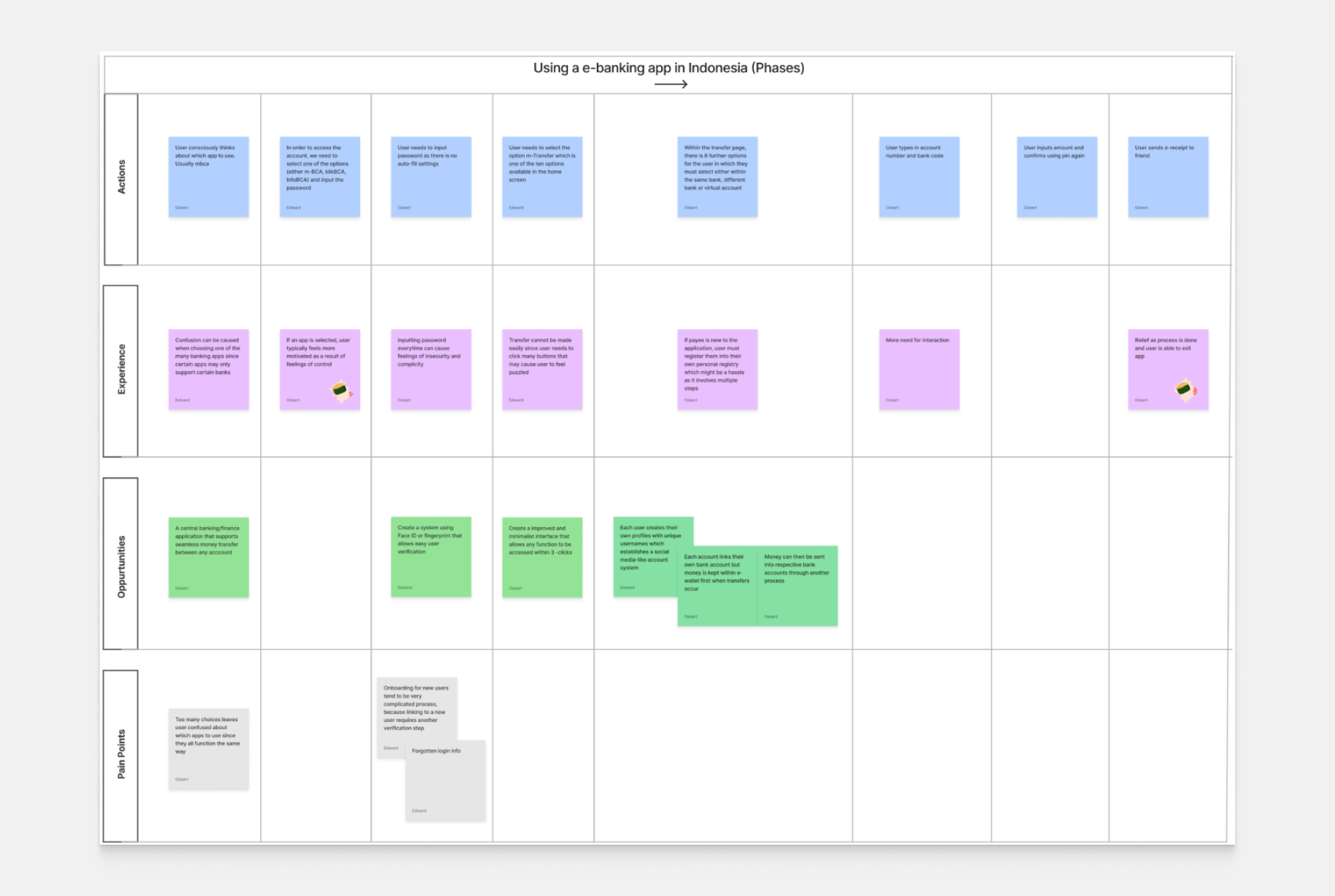
I expanded the graph to reveal a map that talks about the actions, experiences, opportunities and pain points a user goes through from start to finish of a transfer sequence. This diagram goes into further detail regarding the positive and negative aspects of the user experience.
Research
Summary
Experience:
Mostly, a user of these apps will experience dissatisfaction with complexity. Firstly, they will confuse themselves choosing apps. Then, comes the problem of repetitive in-app security. Third and finally, is the very complicated process of transferring money and registering new payees.
Key Opportunities:
The problem of app-choosing-confusion can be solved if we propose a design that serves as the central finance app for the Indonesian public. Creating one app which contains all the other apps’ most essential features. Security can be made convenient with face-id and other biometrics. And of course, apps don’t need to be complicated and this can be done using a properly-designed User Interface
Pain Points:
Apps don’t utilize existing proper UI practices and standards to improve User Experience, leading to confusion and annoyance in some users. Some features like transaction history are neglected and purposely made hard to find. Some people dislike using certain apps because of the difference in functionality, experience and fees with other apps (like how GoPay and mBCA are completely different).
Ideation
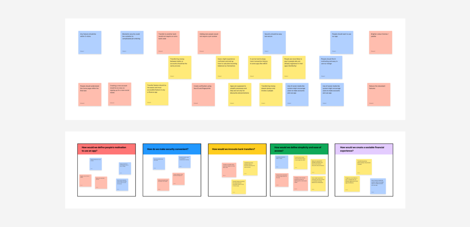
📝 Affinity Map
After I leveraged user insights, I decided to brainstorm and use Figma to create an affinity map. First, I started out by putting any and all ideas I had onto a board given a time limit of 5 minutes.
Since brainstorming resulted in a field of scattered ideas and thoughts, I decided it would be best if I grouped them up first in terms of “related ideas” and then form questions around these ideas that solves each of the problems.
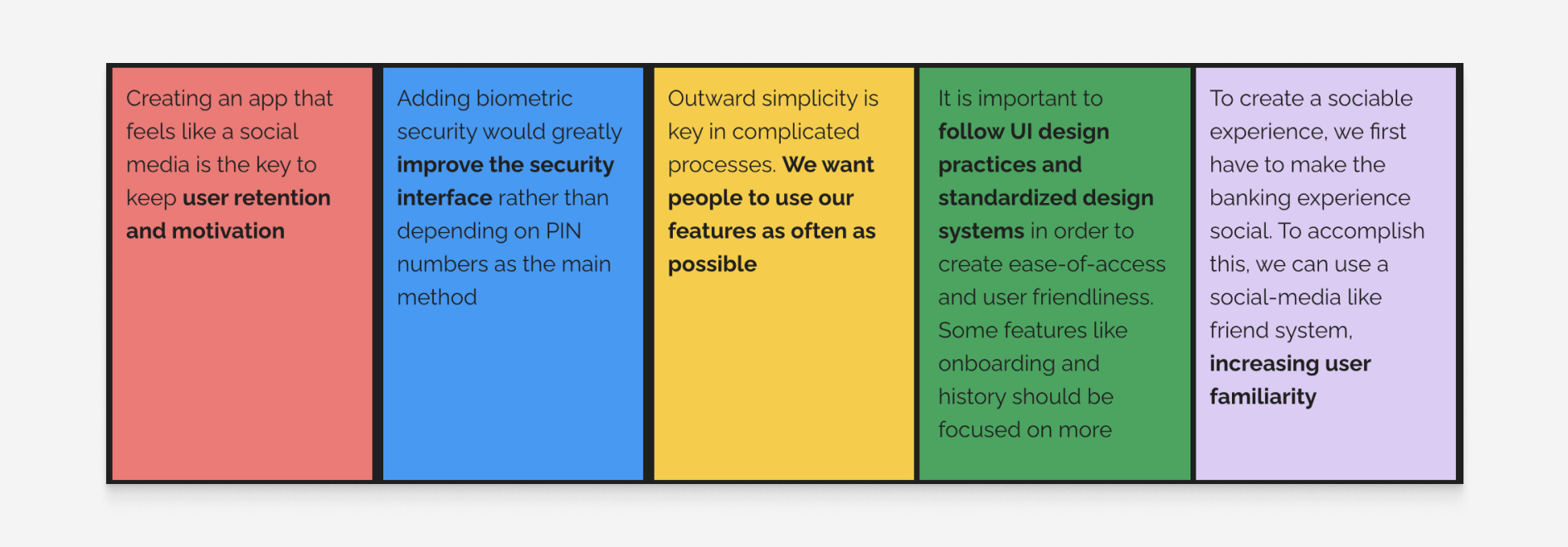
Based on my ideation grouping process and also considering user feedback on Indonesian banking systems, I came up with the some key takeaways.
Design
🪡 Low Fidelity Wireframing
To start the app design, I used insights from the affinity map, customer journey map, market and user research, and persona to create an intuitive layout that the average Indonesian would find seamless. I implemented a social feature to keep user retention, biometric security for simplicity and adaptation to newer technology, straightforward functionalities with adequate signifiers, and a design system to standardize the visual hierarchy.
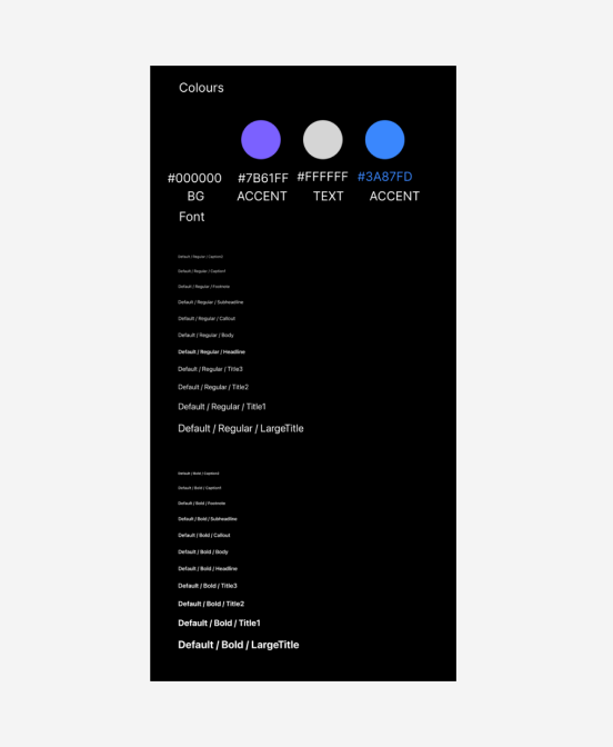
🎨 Style Sheet
To start with the design, since it would be based on IOS, the SF-mono fonts would work best, as users would already be accustomed to it. Another aspect was the “vibe” of the app (Gen-Z jargon, I know D:). To attract more users, I decided to make it neat, with a hint of vibrance through bright contrasting colors. The primary (Background) color would be a shade of grey (not pitch black) so that it’s easier on the eyes, text and text fields would be white, and accent colors would be of a gradient from blue to indigo.Style Sheet
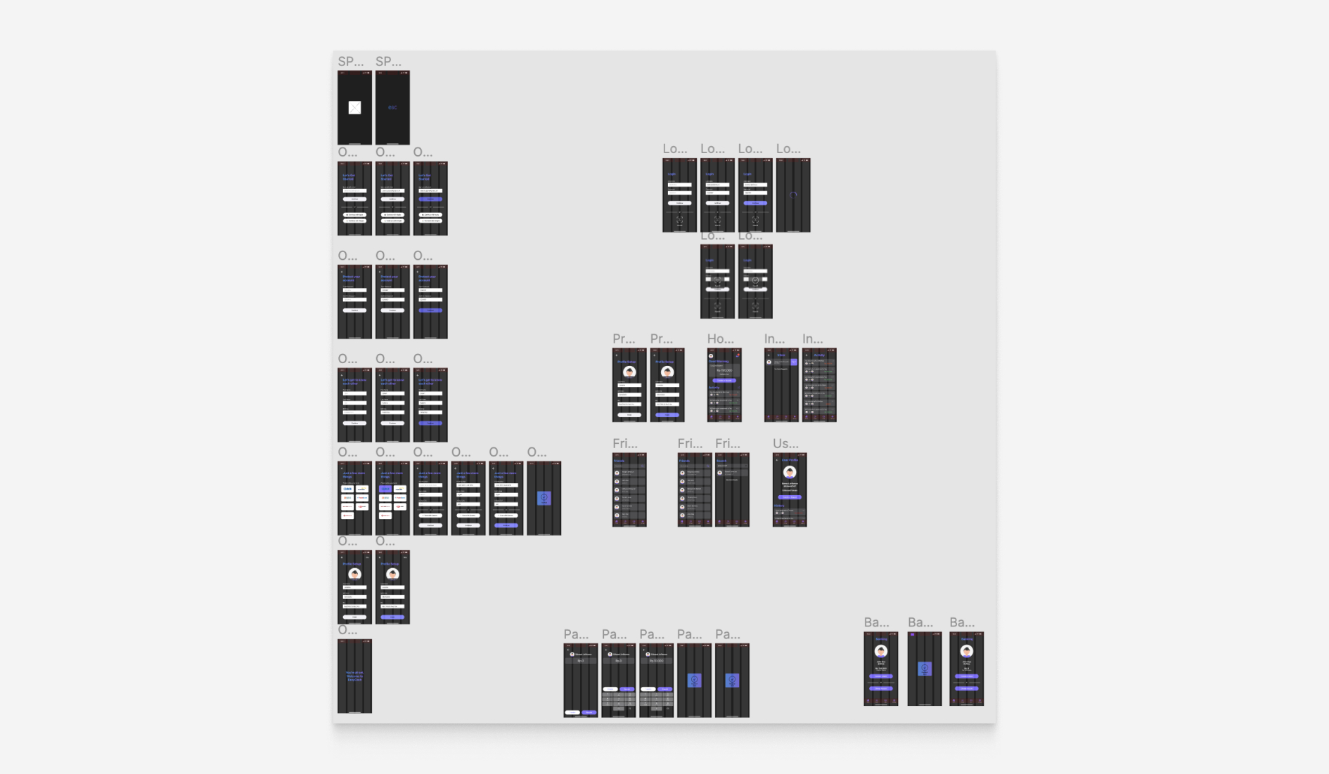
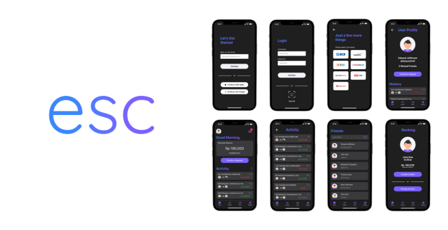
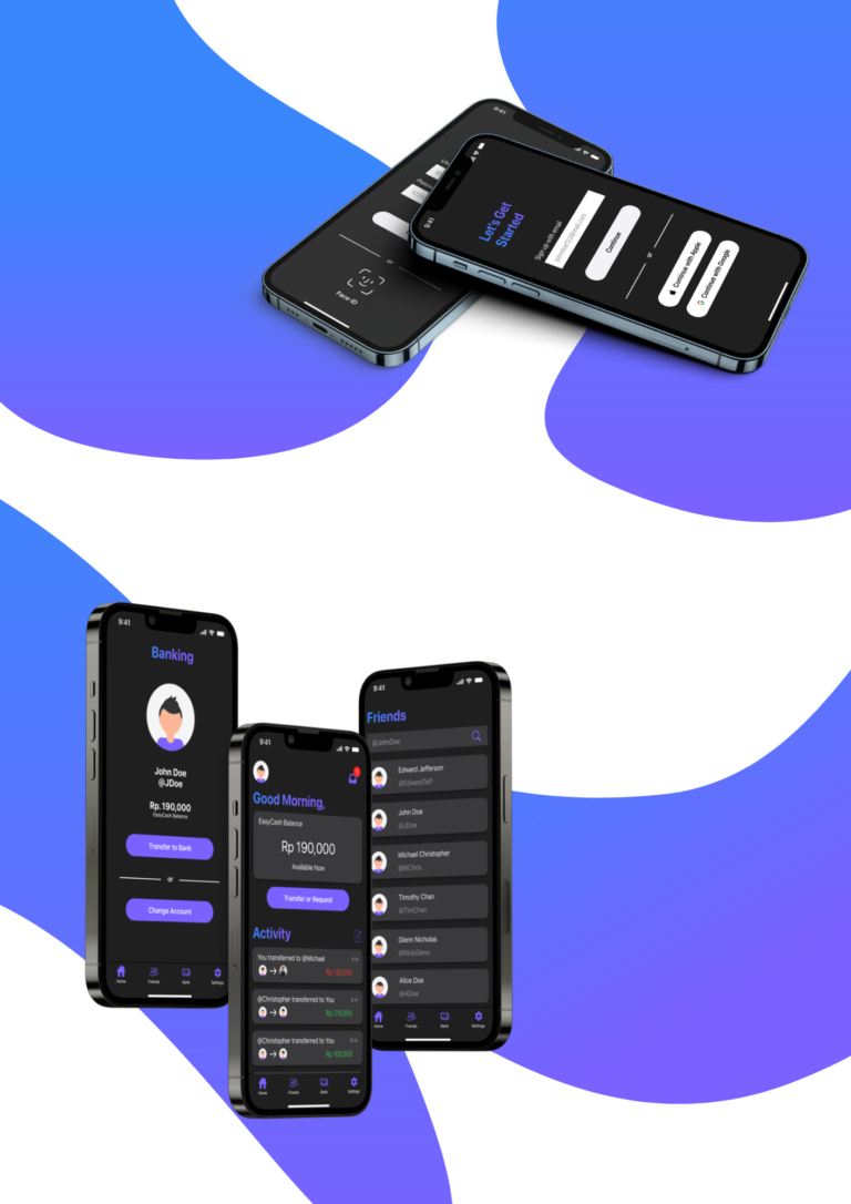
🖼️ High Fidelity Wireframing
After creating the digital low-fidelity wireframe according to the stylesheet, I created the final product, a functioning version of the previous wireframe by using autoflows, prototyping and also adding new designs and logos
Outcome
🧑💻 Development & Release
After a Summer full of designing and ideating, I am proud to have a working prototype for an app that I truly feel would solve a lot of problems in Indonesia. Currently, the EasyCash app is in development with actual code and planned for release sometime late next year. It was a really awesome experience doing this especially since it was one of my first adventures in design and this ignited a passion for further exploration and innovation
Takeaways
1️⃣ Simplicity is Key
This was my first real experience with designing fully-fledged and functioning IOS apps. It was fun to design entire workflows, and low-fidelity frames, then completely translate that into functioning prototypes. Although the functioning of the final app might seem like a little basic, basic is best when it comes to the Indonesia. I realized early on in the design process that less is more, and simplicity is key. Sometimes, the more things we have, the less we are able to appreciate and take notice of them.